HTML / CSS / JS

スクロール
 2026/08/11
 2026/8/11
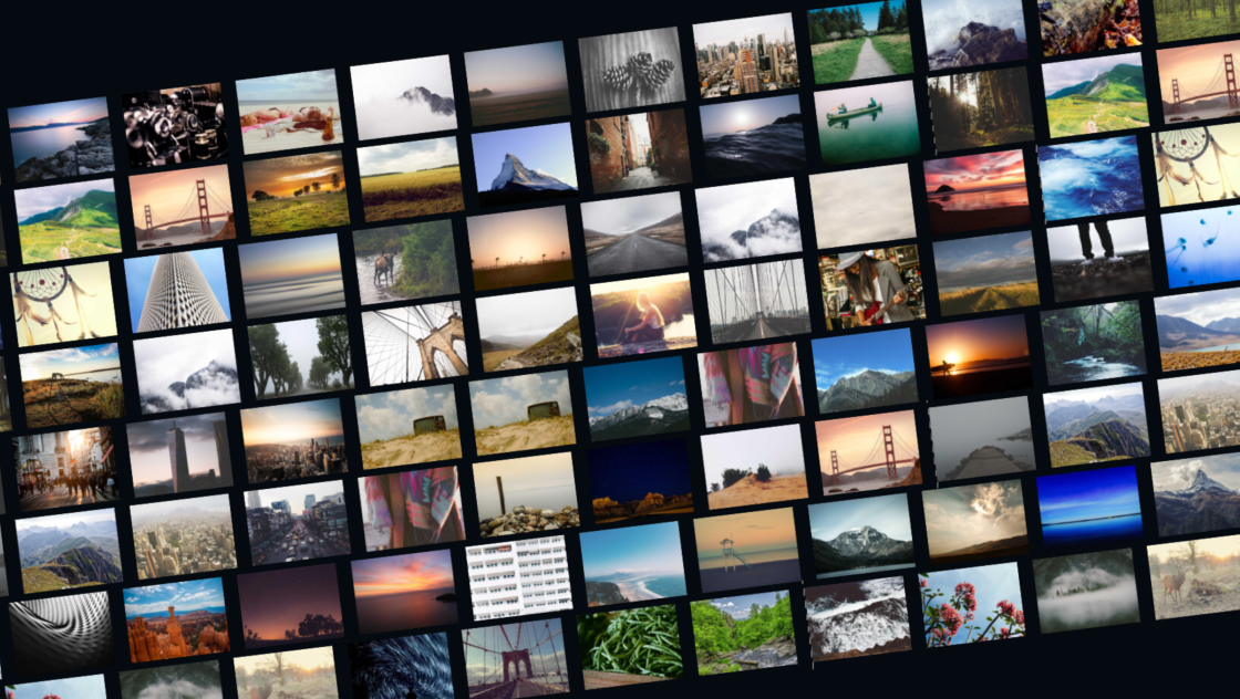
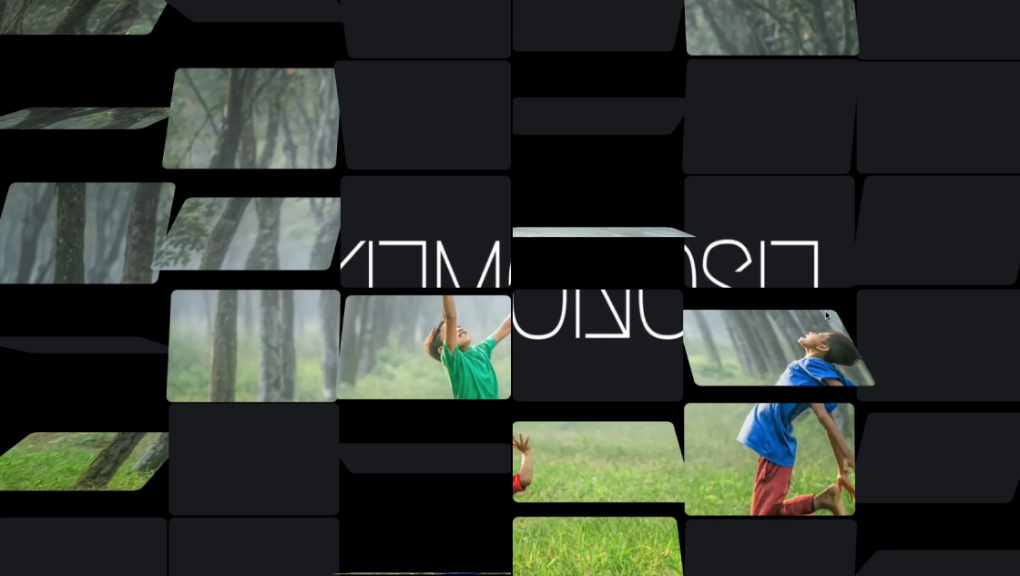
画像カードを3D空間で球体の表面に並べ、スクロールするとその球体がぐるりと回転する――そんなインパクトのあるギャラリーを、CSSの3D transformとGSAPのScrollTriggerで実現したデモです。
カードの配置にはフィボナッチ球面分布を使い、球の表面全体に均等にばらつくよう計算しています。
通常はモノクロ+暗めのフィルターがかかっていますが、スクロール位置に応じた1枚やホバーしたカードだけがフルカラーで浮かび上がり、視線を引きつけます。
position: stickyとperspectiveを組み合わせたビューポート固定の構成で、スクロール量に対して球体が360°回転する没入感のある演出です。
<section class="kumonosu-container">
	<div class="kumonosu-wrapper">
		<div class="kumonosu-sphere" id="kumonosu-sphere"></div>
	</div>
</section>:root {
--bg-dark: #0a0a0b;
--text-main: #f4f4f5;
--clay-base: #18181b;
--clay-shadow: rgba(0, 0, 0, 0.9);
}
* {
margin: 0;
padding: 0;
box-sizing: border-box;
}
body {
background-color: var(--bg-dark);
color: var(--text-main);
font-family: sans-serif;
overflow-x: hidden;
}
.kumonosu-container {
position: relative;
height: 500vh;
width: 100%;
}
.kumonosu-wrapper {
position: sticky;
top: 0;
width: 100%;
height: 100vh;
display: flex;
justify-content: center;
align-items: center;
perspective: 1200px;
}
.kumonosu-sphere {
position: relative;
transform-style: preserve-3d;
will-change: transform;
}
.kumonosu-card {
position: absolute;
background: var(--clay-base);
border-radius: 12px;
padding: 6px;
border: 1px solid rgba(255, 255, 255, 0.03);
box-shadow: 8px 8px 16px var(--clay-shadow);
transition: z-index 0.3s;
}
@media (min-width: 769px) {
.kumonosu-card {
width: 150px;
height: 200px;
margin: -100px 0 0 -75px;
}
}
@media (max-width: 768px) {
.kumonosu-card {
width: 90px;
height: 125px;
margin: -62.5px 0 0 -45px;
}
}
.kumonosu-card img {
width: 100%;
height: 100%;
object-fit: cover;
border-radius: 8px;
filter: grayscale(80%) brightness(0.5);
transition: all 0.5s ease;
cursor: pointer;
}
.kumonosu-card.kumonosu-active img,
.kumonosu-card:hover img {
filter: grayscale(0%) brightness(1.1);
transform: scale(1.15);
box-shadow: 0 0 30px rgba(255, 255, 255, 0.25);
}
.kumonosu-card:hover {
z-index: 100 !important;
}gsap.registerPlugin(ScrollTrigger);
const images = ["https://kumonosu.net/wp-content/uploads/2026/01/176a.jpg.webp", "https://kumonosu.net/wp-content/uploads/2026/01/176b.jpg.webp", "https://kumonosu.net/wp-content/uploads/2026/01/176d.jpg.webp", "https://kumonosu.net/wp-content/uploads/2026/01/176c.jpg.webp", "https://kumonosu.net/wp-content/uploads/2026/01/176f.jpg.webp", "https://kumonosu.net/wp-content/uploads/2026/01/176e.jpg.webp", "https://kumonosu.net/wp-content/uploads/2026/01/176g.jpg.webp", "https://kumonosu.net/wp-content/uploads/2026/01/260114b.jpeg.webp", "https://kumonosu.net/wp-content/uploads/2026/01/260114a.jpeg.webp", "https://kumonosu.net/wp-content/uploads/2026/01/260114c.jpeg.webp"];
const sphereElement = document.getElementById("kumonosu-sphere");
const galleryItems = [...images, ...images, ...images];
const cardElements = [];
galleryItems.forEach((src) => {
const card = document.createElement("div");
card.classList.add("kumonosu-card");
const img = document.createElement("img");
img.src = src;
card.appendChild(img);
sphereElement.appendChild(card);
cardElements.push(card);
});
function updateSphereLayout() {
const screenWidth = window.innerWidth;
const sphereRadius = screenWidth < 768 ? 240 : 380;
cardElements.forEach((card, i) => {
const phi = Math.acos(1 - (2 * (i + 0.5)) / cardElements.length);
const theta = Math.PI * (1 + Math.sqrt(5)) * i;
const x = sphereRadius * Math.cos(theta) * Math.sin(phi);
const y = sphereRadius * Math.sin(theta) * Math.sin(phi);
const z = sphereRadius * Math.cos(phi);
const rotY = Math.atan2(x, z) * (180 / Math.PI);
const rotX = Math.asin(-y / sphereRadius) * (180 / Math.PI);
gsap.set(card, {
x: x,
y: y,
z: z,
rotationY: rotY,
rotationX: rotX
});
});
}
updateSphereLayout();
window.addEventListener("resize", updateSphereLayout);
gsap.to(sphereElement, {
rotationY: 360,
rotationX: 12,
ease: "none",
scrollTrigger: {
trigger: ".kumonosu-container",
start: "top top",
end: "bottom bottom",
scrub: 1.2,
onUpdate: (self) => {
const activeIndex = Math.floor(self.progress * cardElements.length);
cardElements.forEach((card, i) => {
if (i === activeIndex) card.classList.add("kumonosu-active");
else card.classList.remove("kumonosu-active");
});
}
}
});https://cdnjs.cloudflare.com/ajax/libs/gsap/3.12.2/gsap.min.js
https://cdnjs.cloudflare.com/ajax/libs/gsap/3.12.2/ScrollTrigger.min.jsこのデモは、CSSのtransform-style: preserve-3dとperspectiveで3D空間を作り、GSAPのScrollTriggerでスクロールに連動した球体回転を実現しています。
主な機能は以下のとおりです。
scrub: 1.2)により、ページスクロール量に比例して球体がY軸360°+X軸12°回転します。position: stickyでビューポートに固定されたまま回転します。kumonosu-activeクラスが付与されます。z-index: 100で最前面に表示されます。500vhの高さを持つコンテナにより、十分なスクロール量を確保して回転をなめらかにしています。images配列のURLを差し替えるだけで、任意の画像を表示できます。枚数を変えても球面配置が自動で再計算されます。sphereRadiusの値(PC: 380、SP: 240)を変更すると、球体の大きさが変わります。.kumonosu-cardのwidth・heightとメディアクエリ内の値を変更すると、カードの大きさを調整できます。gsap.toのrotationY: 360を変えると、スクロール全体での回転角度が変わります。複数回転させたい場合は720などに増やします。.kumonosu-containerのheight: 500vhを増減すると、回転に必要なスクロール量が変わります。大きくするとゆっくり回り、小さくすると速く回ります。[...images, ...images, ...images]の複製回数を変えると、球体上のカード密度を調整できます。.kumonosu-card imgのfilter: grayscale(80%) brightness(0.5)を変更すると、非アクティブ時の見た目を変えられます。セピアや彩度調整も可能です。--bg-darkのCSS変数を変更すると、背景色を変えられます。cdnjs.cloudflare.com)からGSAP 3.12.2とScrollTriggerプラグインを読み込んでいます。本番環境ではバージョン固定やローカルホスティングを推奨します。preserve-3dによる3D配置のため、ブラウザによっては重なり順(z-index)の解決が完全でない場合があります。特に球体の裏側にあるカードが手前に描画されるケースがあります。500vhのコンテナは視覚的には空白です。このデモの前後にコンテンツを配置する場合、スクロール体験の設計に注意が必要です。rotationXとrotationYを自動計算していますが、球の極付近(上端・下端)ではカードが急角度になり見えにくくなります。scrubの値: scrub: 1.2はスクロールに対するアニメーションの追従の遅延です。値を小さくすると即座に追従し、大きくするとゆったりとした動きになります。