HTML / CSS

ホバー
 2026/01/20
 2026/1/18
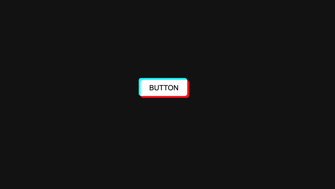
お問い合わせ導線は「見つけてもらえるか」が大事。でも派手すぎるアニメーションは、サイトの雰囲気を壊したり使いにくさにつながることもあります。
このコードはCSSだけで、ホバー時にSVGアイコンの線がスーッと動く控えめな演出を追加したお問い合わせボタン。
シンプルなのに目を惹き、CTAの存在感を自然に上げられます。
<a class="kumonosu-service-button" href="#">
    <div class="kumonosu-icon-circle">
        <svg xmlns="http://www.w3.org/2000/svg" viewBox="0 0 80 80">
            <g class="kumonosu-icon-line">
                <path class="kumonosu-icon-line--1" d="M25.43 53.23c-2.76 0-5-2.24-5-5V31.77c0-2.76 2.24-5 5-5h29.14c2.76 0 5 2.24 5 5v16.46c0 2.76-2.24 5-5 5" />
                <path class="kumonosu-icon-line--2" d="M54.57 26.77c2.76 0 5 2.24 5 5v16.46c0 2.76-2.24 5-5 5H25.43c-2.76 0-5-2.24-5-5V31.77c0-2.76 2.24-5 5-5" />
            </g>
            <g class="kumonosu-icon-base">
                <path d="M54.46 53.71H25.32c-2.76 0-5-2.24-5-5V32.25c0-2.76 2.24-5 5-5h29.14c2.76 0 5 2.24 5 5v16.46c0 2.76-2.24 5-5 5z" />
                <path class="kumonosu-icon-nofill" d="M24.95 35.1l14.44 8.4c0.31 0.18 0.7 0.18 1.01 0l14.44-8.4" />
            </g>
        </svg>
    </div>
    <span class="kumonosu-button-text">お問い合せはこちら</span>
</a>html {
font-size: 62.5%;
}
body {
background-color: #fff;
display: flex;
justify-content: center;
align-items: center;
height: 100vh;
margin: 0;
font-family: "Zen Maru Gothic", sans-serif;
}
/* --- ボタン全体(#987abe) --- */
.kumonosu-service-button {
display: flex;
align-items: center;
text-decoration: none;
background-color: #987abe;
/* 指定の紫 */
padding: 8px 30px 8px 8px;
/* 70pxの円に合わせてスリムに調整 */
border-radius: 80px;
transition: transform 0.6s cubic-bezier(.19, 1, .22, 1),
background-color 0.3s ease;
cursor: pointer;
box-shadow: 0 4px 15px rgba(0, 0, 0, 0.1);
}
.kumonosu-service-button:hover {
transform: scale(1.03);
background-color: #a78bc5;
}
/* --- 左側の白い円エリア(70px) --- */
.kumonosu-icon-circle {
width: 70px;
height: 70px;
background-color: #f9f8f4;
border-radius: 50%;
display: flex;
justify-content: center;
align-items: center;
margin-right: 20px;
position: relative;
overflow: hidden;
flex-shrink: 0;
}
/* アイコンを60pxに拡大 */
.kumonosu-icon-circle svg {
width: 60px;
height: 60px;
display: block;
}
/* 固定の黒線 */
.kumonosu-icon-base {
fill: none;
stroke: #3a3937;
stroke-width: 3.5;
stroke-linecap: round;
stroke-linejoin: round;
}
/* スーッと動くパーツ(#987abe) */
.kumonosu-icon-line path {
fill: none;
stroke: #987abe;
stroke-width: 10;
stroke-linecap: round;
stroke-linejoin: round;
opacity: 0.6;
transition: stroke-dashoffset 0.8s cubic-bezier(.19, 1, .22, 1);
}
/* --- 座標設定(スクショ数値を反映) --- */
.kumonosu-icon-line--1 {
stroke-dasharray: 20px 60px;
stroke-dashoffset: -15px;
}
.kumonosu-service-button:hover .kumonosu-icon-line--1 {
stroke-dashoffset: -59px;
}
.kumonosu-icon-line--2 {
stroke-dasharray: 15px 65px;
stroke-dashoffset: -22px;
}
.kumonosu-service-button:hover .kumonosu-icon-line--2 {
stroke-dashoffset: -58px;
}
/* 封筒のV字部分 */
.kumonosu-icon-nofill {
fill: none;
stroke: #3a3937;
stroke-width: 2.5;
stroke-linecap: round;
stroke-linejoin: round;
}
/* --- 右側のテキスト(20px指定) --- */
.kumonosu-button-text {
color: #ffffff;
font-size: 20px;
font-weight: 700;
letter-spacing: 0.05em;
white-space: nowrap;
}この仕組みのポイントは、SVGの線(path)をdasharray / dashoffsetで動かしているところです。
つまり、封筒以外のSVGでも「線で構成されたアイコン」なら応用できます。
1) 色を変える
.kumonosu-service-button { background-color: ... }.kumonosu-icon-line path { stroke: ... }.kumonosu-icon-base { stroke: ... }ブランドカラーに合わせるなら、ここをまとめて変更するのが最短です。
2) 動きの強さ(スピード・距離)を変える
transition: stroke-dashoffset 0.8s ... の秒数を調整.kumonosu-icon-line--1 / --2 の stroke-dashoffset の数値を調整3) アイコンを差し替える(封筒→電話/チャットなど)
<svg ...> ... </svg> を別アイコンに置き換え※塗り(fill)メインのアイコンだと「線が流れる演出」が効きにくいので、線画アイコンが相性◎。
4) サイズ調整
.kumonosu-icon-circle { width/height: 70px; }.kumonosu-icon-circle svg { width/height: 60px; }.kumonosu-button-text { font-size: 20px; }「気づかれる」けど「うるさくない」ので、実務で使いやすいタイプです。
transition や transform はサイト全体の動きと合わせる@media (prefers-reduced-motion: reduce) でアニメーションを弱める/止めるのもおすすめです。