HTML / CSS

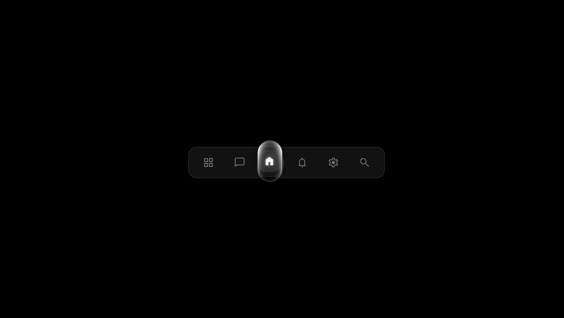
ホバー
 2026/01/19
 2026/1/18
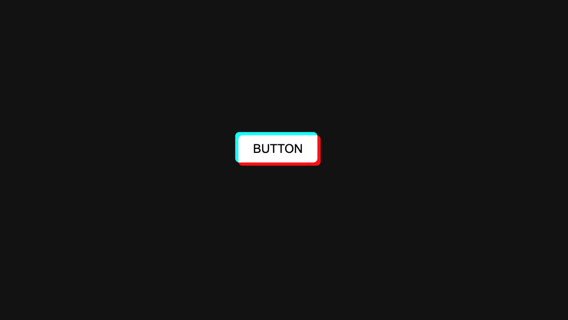
Webデザインのクオリティを左右するのは、細かな「インタラクション」です。
今回は、ホバーした瞬間にボタン内のアイコンが鮮やかに切り替わり、下線が滑らかに伸びる非常に洗練されたボタンアニメーションをご紹介します。
JavaScriptライブラリ「GSAP」を使用し、初心者でもコピペで実装できるクリーンなコードに仕上げました。
<div class="kumonosu-section__wrap">
    <div class="kumonosu-button js-button">
        <a class="kumonosu-button__link" href="#">
            <div class="kumonosu-button__wrap">
                <span class="kumonosu-button__label js-button-label">VIEW ALL</span>
                <div class="kumonosu-arrow-wrapper">
                    <div class="kumonosu-arrow-circle-mask js-circle-mask">
                        <svg class="kumonosu-arrow-svg js-arrow-white" xmlns="http://www.w3.org/2000/svg" viewBox="0 0 20.828 12.343">
                            <line x1="1" y1="6.17" x2="18" y2="6.17" stroke-linecap="round"></line>
                            <path d="M14,1.17l5,5-5,5" stroke-linecap="round" stroke-linejoin="round"></path>
                        </svg>
                    </div>
                </div>
                <div class="kumonosu-button__border js-button-border"></div>
            </div>
        </a>
    </div>
</div>:root {
--kumonosu-primary: #6a5fed;
--kumonosu-text: #222;
}
body {
background-color: #f8f9fa;
display: flex;
justify-content: center;
align-items: center;
height: 100vh;
margin: 0;
font-family: "Helvetica Neue", Arial, "Hiragino Kaku Gothic ProN", "Hiragino Sans", Meiryo, sans-serif;
-webkit-font-smoothing: antialiased;
}
.kumonosu-button {
position: relative;
display: inline-block;
cursor: pointer;
user-select: none;
}
.kumonosu-button__link {
text-decoration: none;
display: block;
color: var(--kumonosu-text);
}
.kumonosu-button__wrap {
position: relative;
display: flex;
align-items: center;
padding: 0 0 12px 0;
}
.kumonosu-button__label {
font-size: 16px;
font-weight: 700;
letter-spacing: 0.12em;
margin-right: 50px;
position: relative;
z-index: 2;
}
.kumonosu-arrow-wrapper {
position: relative;
width: 48px;
height: 48px;
display: flex;
justify-content: center;
align-items: center;
}
.kumonosu-arrow-circle-mask {
position: absolute;
width: 48px;
height: 48px;
background-color: var(--kumonosu-primary);
border-radius: 50%;
overflow: hidden;
z-index: 2;
pointer-events: none;
transform-origin: center center;
display: flex;
justify-content: center;
align-items: center;
}
.kumonosu-arrow-svg {
position: absolute;
width: 20px;
height: 12px;
fill: none;
stroke-width: 2.5px;
stroke: #fff;
}
.kumonosu-button__border {
position: absolute;
bottom: 0;
left: 0;
width: 100%;
height: 2px;
background-color: var(--kumonosu-primary);
transform: scaleX(0);
transform-origin: left center;
}window.onload = () => {
const button = document.querySelector('.js-button');
const label = document.querySelector('.js-button-label');
const circleMask = document.querySelector('.js-circle-mask');
const arrowWhite = document.querySelector('.js-arrow-white');
const border = document.querySelector('.js-button-border');
const duration = 0.5;
const ease = "expo.inOut";
// メインカラーを #6a5fed に更新
const primaryColor = "#6a5fed";
button.addEventListener('mouseenter', () => {
// テキストと円の基本アニメーション
gsap.to(label, {
x: 10,
color: primaryColor,
duration: duration,
ease: ease
});
gsap.to(circleMask, {
scale: 0.15,
duration: duration,
ease: ease
});
gsap.to(border, {
scaleX: 1,
duration: duration,
ease: ease,
transformOrigin: "left"
});
// 矢印:中央から右へ消える
gsap.killTweensOf(arrowWhite);
gsap.set(arrowWhite, {
x: 0,
opacity: 1
});
gsap.to(arrowWhite, {
x: 40,
opacity: 0,
duration: duration,
ease: ease,
immediateRender: false
});
});
button.addEventListener('mouseleave', () => {
// 基本状態へ戻す
gsap.to(label, {
x: 0,
color: "#222",
duration: duration,
ease: ease
});
gsap.to(circleMask, {
scale: 1,
duration: duration,
ease: ease
});
gsap.to(border, {
scaleX: 0,
duration: 0.4,
ease: "power2.inOut",
transformOrigin: "right"
});
// 矢印:左から中央へ現れる
gsap.killTweensOf(arrowWhite);
gsap.set(arrowWhite, {
x: -40,
opacity: 0
});
gsap.to(arrowWhite, {
x: 0,
opacity: 1,
duration: duration,
ease: ease,
immediateRender: false
});
});
};https://cdnjs.cloudflare.com/ajax/libs/gsap/3.12.2/gsap.min.jsこのボタンアニメーションには、3つの大きな特徴があります。
<a>タグや<span>タグにアニメーションをかける際は、CSSでdisplay: inline-blockやflexを指定し、座標(x, y)が正しく計算されるようにしてください。