
HTML / CSS / JS

ビジュアル
 2026/04/09
 2026/4/3
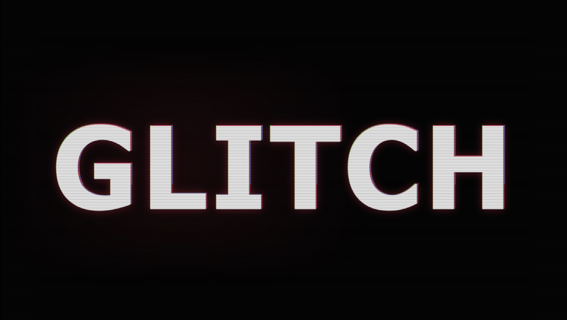
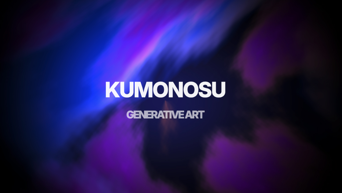
印象的なファーストビューやローディング画面を作りたいとき、強い世界観を演出できるテキストアニメーションは非常に効果的です。
このコードでは、JavaScriptを使わずCSSだけでグリッチノイズや画面干渉のような演出を再現しています。
複数のアニメーションを重ねることで、まるでデジタル信号が乱れているかのようなサイバーテイストの表現を実現しています。
<div class="kumonosu-container">
	<div class="kumonosu-glitch" data-text="KUMONOSU">KUMONOSU</div>
	<div class="kumonosu-glow">KUMONOSU</div>
</div>
<div class="kumonosu-scanlines"></div>
<div class="kumonosu-glitch-line-wrapper">
	<div class="kumonosu-glitch-line"></div>
	<div class="kumonosu-glitch-line"></div>
	<div class="kumonosu-glitch-line"></div>
</div>@import url('https://fonts.googleapis.com/css2?family=Oswald:ital,wght@0,200..700;1,200..700&display=swap');
* {
margin: 0;
padding: 0;
box-sizing: border-box;
}
body {
background: #0a0a0a;
font-family: "Oswald", sans-serif;
font-style: italic;
min-height: 100vh;
overflow: hidden;
animation: screen-shake 10s infinite;
}
.kumonosu-container {
position: absolute;
transform: translate(-50%, -50%);
top: 50%;
left: 50%;
width: 100%;
text-align: center;
z-index: 10;
}
.kumonosu-glitch {
color: rgb(223, 164, 1);
position: relative;
font-size: 9vw;
animation: glitch 5s 5s infinite, flicker 0.15s infinite,
hard-glitch 8s infinite;
text-shadow: 2px 0 rgba(255, 0, 0, 0.5), -2px 0 rgba(0, 255, 255, 0.5);
display: inline-block;
}
.kumonosu-glitch::before {
content: attr(data-text);
position: absolute;
left: -2px;
text-shadow: -5px 0 magenta;
background: #0a0a0a;
overflow: hidden;
top: 0;
width: 100%;
height: 100%;
animation: noise-1 3s linear infinite alternate-reverse,
glitch 5s 5.05s infinite, rgb-shift-left 8s infinite;
}
.kumonosu-glitch::after {
content: attr(data-text);
position: absolute;
left: 2px;
text-shadow: 5px 0 lightgreen;
background: #0a0a0a;
overflow: hidden;
top: 0;
width: 100%;
height: 100%;
animation: noise-2 3s linear infinite alternate-reverse, glitch 5s 5s infinite,
rgb-shift-right 8s infinite;
}
@keyframes glitch {
1% {
transform: rotateX(10deg) skewX(90deg);
}
2% {
transform: rotateX(0deg) skewX(0deg);
}
}
@keyframes flicker {
0%, 100% {
opacity: 1;
}
33% {
opacity: 0.95;
}
66% {
opacity: 0.98;
}
}
@keyframes hard-glitch {
0%, 87%, 92%, 100% {
transform: none;
filter: none;
}
88% {
transform: skewX(-20deg) scaleY(1.1);
filter: hue-rotate(90deg);
}
89% {
transform: skewX(15deg) scaleX(0.95);
filter: hue-rotate(-60deg) saturate(2);
}
90% {
transform: translate(-10px, 3px);
filter: blur(1px);
}
91% {
transform: translate(5px, -2px) skewY(5deg);
filter: brightness(1.5);
}
}
@keyframes rgb-shift-left {
0%, 90%, 100% {
left: -2px;
}
92% {
left: -12px;
}
94% {
left: 6px;
}
96% {
left: -6px;
}
98% {
left: 3px;
}
}
@keyframes rgb-shift-right {
0%, 90%, 100% {
left: 2px;
}
92% {
left: 10px;
}
94% {
left: -8px;
}
96% {
left: 5px;
}
98% {
left: -3px;
}
}
@keyframes noise-1 {
0% {
clip-path: inset(40px 0 61px 0);
transform: translateX(-2px);
}
5% {
clip-path: inset(12px 0 85px 0);
transform: translateX(1px);
}
10% {
clip-path: inset(78px 0 5px 0);
transform: translateX(-3px);
}
15% {
clip-path: inset(25px 0 58px 0);
transform: translateX(2px);
}
20% {
clip-path: inset(92px 0 2px 0);
transform: translateX(-1px);
}
25% {
clip-path: inset(5px 0 78px 0);
transform: translateX(3px);
}
30% {
clip-path: inset(48px 0 35px 0);
transform: translateX(-2px);
}
35% {
clip-path: inset(68px 0 22px 0);
transform: translateX(1px);
}
40% {
clip-path: inset(15px 0 70px 0);
transform: translateX(-1px);
}
45% {
clip-path: inset(85px 0 8px 0);
transform: translateX(2px);
}
50% {
clip-path: inset(33px 0 52px 0);
transform: translateX(-3px);
}
55% {
clip-path: inset(7px 0 80px 0);
transform: translateX(1px);
}
60% {
clip-path: inset(55px 0 30px 0);
transform: translateX(-2px);
}
65% {
clip-path: inset(95px 0 1px 0);
transform: translateX(2px);
}
70% {
clip-path: inset(20px 0 65px 0);
transform: translateX(-1px);
}
75% {
clip-path: inset(72px 0 18px 0);
transform: translateX(3px);
}
80% {
clip-path: inset(3px 0 88px 0);
transform: translateX(-2px);
}
85% {
clip-path: inset(45px 0 40px 0);
transform: translateX(1px);
}
90% {
clip-path: inset(82px 0 10px 0);
transform: translateX(-1px);
}
95% {
clip-path: inset(28px 0 55px 0);
transform: translateX(2px);
}
100% {
clip-path: inset(60px 0 25px 0);
transform: translateX(-3px);
}
}
@keyframes noise-2 {
0% {
clip-path: inset(65px 0 20px 0);
transform: translateX(3px);
}
5% {
clip-path: inset(18px 0 75px 0);
transform: translateX(-1px);
}
10% {
clip-path: inset(88px 0 5px 0);
transform: translateX(2px);
}
15% {
clip-path: inset(35px 0 50px 0);
transform: translateX(-2px);
}
20% {
clip-path: inset(8px 0 82px 0);
transform: translateX(1px);
}
25% {
clip-path: inset(70px 0 18px 0);
transform: translateX(-3px);
}
30% {
clip-path: inset(42px 0 45px 0);
transform: translateX(2px);
}
35% {
clip-path: inset(90px 0 3px 0);
transform: translateX(-1px);
}
40% {
clip-path: inset(22px 0 62px 0);
transform: translateX(1px);
}
45% {
clip-path: inset(55px 0 32px 0);
transform: translateX(-2px);
}
50% {
clip-path: inset(12px 0 78px 0);
transform: translateX(3px);
}
55% {
clip-path: inset(75px 0 15px 0);
transform: translateX(-1px);
}
60% {
clip-path: inset(38px 0 48px 0);
transform: translateX(2px);
}
65% {
clip-path: inset(2px 0 92px 0);
transform: translateX(-2px);
}
70% {
clip-path: inset(58px 0 28px 0);
transform: translateX(1px);
}
75% {
clip-path: inset(85px 0 8px 0);
transform: translateX(-3px);
}
80% {
clip-path: inset(30px 0 55px 0);
transform: translateX(2px);
}
85% {
clip-path: inset(68px 0 22px 0);
transform: translateX(-1px);
}
90% {
clip-path: inset(15px 0 72px 0);
transform: translateX(1px);
}
95% {
clip-path: inset(48px 0 38px 0);
transform: translateX(-2px);
}
100% {
clip-path: inset(80px 0 12px 0);
transform: translateX(3px);
}
}
@keyframes screen-shake {
0%, 95%, 100% {
transform: none;
}
96% {
transform: translate(2px, 0);
}
97% {
transform: translate(-2px, 1px);
}
98% {
transform: translate(0, -1px);
}
99% {
transform: translate(1px, 1px);
}
}
.kumonosu-scanlines {
position: fixed;
top: 0;
left: 0;
width: 100%;
height: 100%;
overflow: hidden;
mix-blend-mode: difference;
pointer-events: none;
z-index: 1000;
}
.kumonosu-scanlines::before {
content: "";
position: absolute;
width: 100%;
height: 100%;
top: 0;
left: 0;
background: repeating-linear-gradient(to bottom,
transparent 0%,
rgba(255, 255, 255, 0.05) 0.5%,
transparent 1%);
animation: fudge 7s ease-in-out alternate infinite;
}
.kumonosu-scanlines::after {
content: "";
position: fixed;
top: 0;
left: 0;
right: 0;
bottom: 0;
background: radial-gradient(ellipse at center,
transparent 0%,
rgba(0, 0, 0, 0.2) 70%,
rgba(0, 0, 0, 0.5) 100%);
pointer-events: none;
}
@keyframes fudge {
from {
transform: translate(0px, 0px);
}
to {
transform: translate(0px, 2%);
}
}
.kumonosu-glow {
color: transparent;
position: absolute;
top: 0;
left: 0;
width: 100%;
font-size: 9vw;
text-shadow: 0 0 80px rgb(223, 191, 191);
animation: glow-pulse 4s ease-in-out infinite;
pointer-events: none;
}
@keyframes glow-pulse {
0%, 100% {
text-shadow: 0 0 60px rgb(223, 191, 191);
opacity: 0.4;
}
50% {
text-shadow: 0 0 80px rgb(223, 191, 191), 0 0 120px rgba(255, 100, 100, 0.4),
0 0 150px rgba(255, 50, 50, 0.2);
opacity: 0.7;
}
}
.kumonosu-glitch-line-wrapper {
position: fixed;
top: 0;
left: 0;
width: 100%;
height: 100%;
pointer-events: none;
z-index: 500;
}
.kumonosu-glitch-line {
position: absolute;
height: 2px;
width: 100%;
background: rgba(255, 255, 255, 0.1);
left: 0;
opacity: 0;
animation: glitch-line 4s infinite;
}
.kumonosu-glitch-line:nth-of-type(1) {
top: 20%;
animation-delay: 0s;
}
.kumonosu-glitch-line:nth-of-type(2) {
top: 50%;
animation-delay: 1.5s;
}
.kumonosu-glitch-line:nth-of-type(3) {
top: 80%;
animation-delay: 3s;
}
@keyframes glitch-line {
0%, 90%, 100% {
opacity: 0;
transform: translateX(0);
}
92% {
opacity: 1;
transform: translateX(-5%);
background: rgba(255, 0, 255, 0.3);
}
94% {
opacity: 1;
transform: translateX(3%);
background: rgba(0, 255, 255, 0.3);
}
96% {
opacity: 0.5;
transform: translateX(-2%);
}
}
@media (max-width: 768px) {
.kumonosu-glitch, .kumonosu-glow {
font-size: 15vw;
}
}中央配置された .kumonosu-container の中に、メインテキスト .kumonosu-glitch と発光用レイヤー .kumonosu-glow を重ねる構造になっています。
テキストは疑似要素 ::before と ::after を利用して同じ文字列を複製し、それぞれ異なるアニメーションを適用することでグリッチ表現を作っています。
さらに全画面レイヤーとして以下を追加しています。
・スキャンライン表示 .kumonosu-scanlines
・横方向ノイズライン .kumonosu-glitch-line
・画面全体の揺れアニメーション(body)
複数レイヤーを重ねることで映像的なノイズ感を再現しています。
この演出は複数のCSSアニメーションを同時に動かして構成されています。
主な演出要素は次の通りです。
・RGB色ズレ(text-shadow + 疑似要素)
・clip-path を使った断続的なノイズ分断
・色相変化や歪みを加えるハードグリッチ
・ランダム風のちらつき(flicker)
・画面全体の微振動(screen-shake)
・CRTモニター風スキャンライン
・テキスト発光アニメーション
特に clip-path: inset() を時間変化させることで、映像信号が崩れるような表現をCSSのみで実現しています。
テキスト内容は .kumonosu-glitch のテキストと data-text 属性を同じ文字に変更するだけで差し替え可能です。
文字サイズは font-size: 9vw; を変更するとレスポンシブなスケールを調整できます。
グリッチ強度は以下で調整できます。
・RGBズレ量 → left の移動値
・ノイズ頻度 → noise-1 / noise-2 の keyframes
・揺れ強度 → screen-shake の translate 値
・発光強度 → .kumonosu-glow の text-shadow
スキャンラインの密度は repeating-linear-gradient の間隔を変更すると印象が変わります。
アニメーション数が多いため、低スペック端末ではGPU負荷が高くなる場合があります。長時間表示する場合はアニメーション時間を長くするか、一部演出を減らすとパフォーマンスが安定します。
overflow: hidden を body に指定しているため、通常のスクロールページとして使用する場合は削除または調整が必要です。
また、強い点滅や揺れを含む演出のため、長時間閲覧を想定するUIよりも、ファーストビュー・ローディング・タイトル演出など短時間表示の用途に向いています。
フォントは Google Fonts の Oswald を使用しているため、オフライン環境では代替フォントが表示されます。ブランド用途ではフォント指定の見直しをおすすめします。