HTML / CSS / JS

アニメーション
 2026/01/17
 2026/1/15
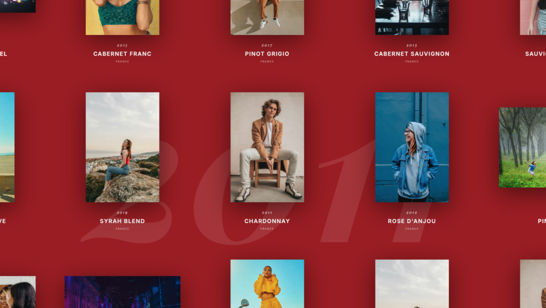
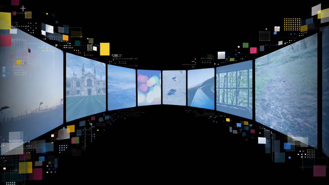
トップページを開いた瞬間に「おっ」と目を引く、3枚の画像がふわっと現れて左右に展開するメインビジュアルアニメーションです。
CSSのtransformとtransitionで動きを作り、JSは読み込み後にis-mv-endクラスを付けるだけのシンプル構成。
※この演出はサイトが開いた時(load)に動くため、動作確認する場合はブラウザを更新(リロード)して確認してください。
<div class="kumonosu-pictures">
    <figure class="kumonosu-pictures__item">
        <img src="https://kumonosu.net/wp-content/uploads/2026/01/260114c.jpeg.webp" alt="左側の画像">
    </figure>
    <figure class="kumonosu-pictures__item">
        <img src="https://kumonosu.net/wp-content/uploads/2026/01/260114b.jpeg.webp" alt="真ん中の画像">
    </figure>
    <figure class="kumonosu-pictures__item">
        <img src="https://kumonosu.net/wp-content/uploads/2026/01/260114a.jpeg.webp" alt="右側の画像">
    </figure>
</div>body {
margin: 0;
padding: 0;
background-color: #000;
display: flex;
justify-content: center;
align-items: center;
min-height: 100vh;
overflow: hidden;
font-family: sans-serif;
}
/* コンテナ */
.kumonosu-pictures {
position: relative;
display: flex;
justify-content: center;
align-items: center;
width: 100%;
height: 60vh;
}
/* アイテム */
.kumonosu-pictures__item {
margin: 0;
position: absolute;
z-index: 3;
opacity: 0;
transform: translateY(10%) scale(0.9);
transition: 0.8s cubic-bezier(0.33, 1, 0.68, 1);
will-change: transform, opacity;
}
.kumonosu-pictures__item img {
width: clamp(150px, 30vw, 420px);
aspect-ratio: 1 / 1;
object-fit: cover;
border-radius: 2rem;
border: 1px solid #969696;
display: block;
}
/* アニメーション開始 */
.kumonosu-is-mv-end .kumonosu-pictures__item {
opacity: 1;
}
/* 左 */
.kumonosu-pictures__item:nth-child(1) {
z-index: 1;
transition-delay: 0.1s;
}
.kumonosu-is-mv-end .kumonosu-pictures__item:nth-child(1) {
transform: translate(-70%, 10%) rotate(-12deg);
}
/* 中央 */
.kumonosu-pictures__item:nth-child(2) {
position: relative;
z-index: 5;
transition-delay: 0s;
}
.kumonosu-is-mv-end .kumonosu-pictures__item:nth-child(2) {
transform: translate(0, 0) rotate(0deg);
}
/* 右 */
.kumonosu-pictures__item:nth-child(3) {
z-index: 2;
transition-delay: 0.15s;
}
.kumonosu-is-mv-end .kumonosu-pictures__item:nth-child(3) {
transform: translate(70%, 10%) rotate(12deg);
}
window.addEventListener('load', () => {
	setTimeout(() => {
		document.body.classList.add('kumonosu-is-mv-end');
	}, 300);
});
複数の画像をfigureで用意し、position: absoluteで中央に重ねて配置しています。
初期状態ではopacity: 0にしておき、ページを開いた直後は何も表示されません。
ページ読み込み後、JavaScriptでbodyに.is-mv-endクラスを付与すると、CSSのアニメーションが開始します。
画像はフェードインしながら左右に展開し、少しだけ回転することで、柔らかい動きになります。
処理の流れを簡単にまとめると以下です。
.is-mv-endを付与opacityとtransformを切り替えて表示transition-delayで出る順番を少しずらすこれにより、画像がふわっと広がるメインビジュアル演出になります。
<figure><img src="..." alt="..."></figure>srcを変更するだけでOKobject-fit: coverが効きます.p-top-mv__pictures img {
width: clamp(150px, 30vw, 420px);
}
150px:最小サイズ30vw:画面幅に応じた基準420px:最大サイズ.is-mv-end .p-top-mv__pictures figure:nth-child(1) {
transform: translate(-70%, 10%) rotate(-12deg);
}
.is-mv-end .p-top-mv__pictures figure:nth-child(3) {
transform: translate(70%, 10%) rotate(12deg);
}
translate(±70%, 10%)の**±70%**を増やすと「もっと広がる」rotate(±12deg)を小さくすると「整った印象」、大きくすると「動き強め」.p-top-mv__pictures figure {
transition: 0.8s cubic-bezier(0.33, 1, 0.68, 1);
}
0.8sを1.2sにするとゆったりcubic-bezier(...)をeaseにすると標準的な動きにsetTimeout(function() {
document.body.classList.add('is-mv-end');
}, 300);
300を0にすると即開始.p-top-mv__pictures {
height: 60vh;
}
70vh〜90vhもアリ50vhなどにabsoluteで重なっているので、レイアウト内に置く場合は、親コンテナのheightがないと潰れて見えます(今は60vhで確保済み)nth-child()の指定も増減が必要ですoverflow: hidden;がbodyに入っているので、ページ全体設計によっては外す/移動が必要です